Challenger Breadware
Content Designer/Strategist | UX Writer | Marketing Email Designer + Strategist —3-month redesign
Deliverables: competitive/comparative analysis + diagrams, journey maps, sketches, wireframes, prototypes
Tools: WordPress, Figma, Google Suite, MailChimp, paper, pen
Collaborators: Creative Director, UX Product Designer, Web Developers, Product Photographer, Marketing
With an updated site, email marketing, and an improved social media presence, we increased sales by an astonishing 800%. See how.
Collaboration
Challenger Breadware was undergoing a major redesign when I came onto the project. I collaborated closely with the design director, developers, and product photographer. Initially, I performed a content audit, revised and rewrote pages, edited all content, and wrote product copy and long-form passages.
Glossary + ingredients
The new site includes more than 200 glossary entries and an extensive ingredients list. I edited all entries for clarification and updated type weights for navigational ease.
FAQs, Our Story
I conceptualized the FAQs layout and rewrote and edited each entry. I also wrote the ‘About Challenger Breadware’ for the press packet and the Our Story section.
Customized for you
I conceptualized the FAQs layout and rewrote and edited each entry. I also wrote the ‘About Challenger Breadware’ for the press packet and the Our Story section.
Marketing emails
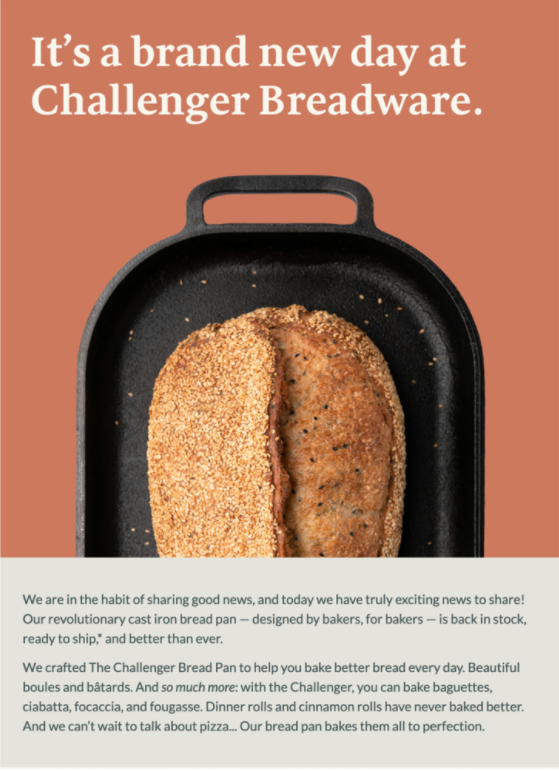
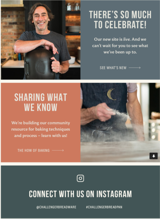
After the site launch, I shifted my focus and began designing layouts and creating content for marketing emails. We strategized content and conceptualized design, using Mailchimp to create and release an automated email funnel. The emails were designed to celebrate the community spirit of the brand, recipes, and shared knowledge. We also built a library of components in Figma for use in future emails.
Welcome
Our initial welcome email was sent out with the launch of the new website. This email would serve as a jumping-off point for future emails and also follow the design, brand, and storytelling aspects of the redesigned website.
As seen in
The Challenger Bread Pan already had fans and great press. For our second email, we focused on that early attention, opening the page with a gif of the pan in action and following up with quotes and press callouts.
Community
From donating hundreds of loaves of bread to local food banks to forging personal relationships with fellow bakers, Challenger Breadware has always been about community. This email served as a love letter to fans, new and old.
Welcome email
The welcome email demonstrates a high-level introduction to Challenger Breadware’s ethos, product, and site redesign.
Pan page addition
After the launch, we created an additional page to highlight the incredibly popular Challenger Bread Pan. We sketched out various options for the pan page including an interactive pan, video, and graphics of the pan’s features.
High fidelity screens
We utilized the design system we’d built for our email marketing to quickly put prototypes together for client approval.
All about the pan
In the end, our client chose to use the interactive pan with callouts to quickly introduce bakers to the pan’s features.
Recipe page addition
With more folks staying at home and baking bread, we workshopped a recipe page to showcase Jim’s Sourdough Bread. We considered what we could accomplish quickly and also thought about future recipes.
Something new?
We considered following the design patterns we’d used when we created the FAQ page (Option A), but because we had such a great Product Photographer, we also wanted a more visually striking choice (Option B).
How many recipes?
After settling on Option B, we debated which recipes to include for the recipe page launch. Although the client had plenty of recipes in his arsenal, time was a factor.
Splash for now
Eventually, we went for a splash page for the first recipe. The client’s popular sourdough recipe was the obvious choice to kick off the latest page!
Keep it simple sourdough
We started our recipe bank with our client’s fan-favorite sourdough recipe.
Shopping cart hover
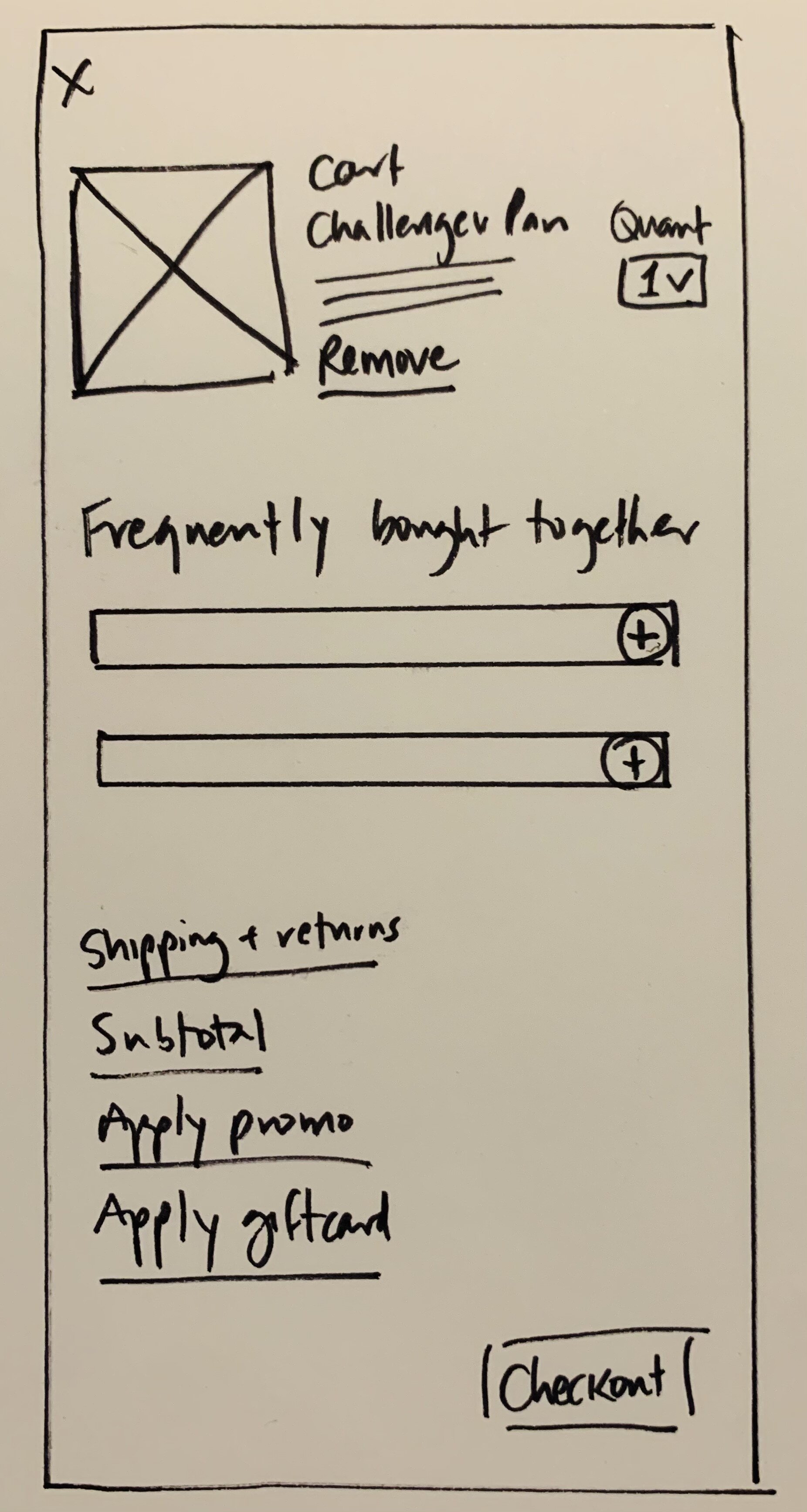
The incredible popularity of the pan and site gave us the opportunity to improve the user’s shopping experience.
Hover checkout
We redesigned the quick view tabs and shopping cart hover screen to allow users to quickly visit their carts and add or subtract items.


